Well, it's official!.. EHAG * Eclectic Halloween Artists Group * has a new logo, and I designed it! Behind closed doors, or tucked away in front of our computer monitors, the moderators of EHAG, including myself have been thinking of new ways to put a fresh face on EHAG. Image is certainly key, and a new logo design was an obvious answer! With my graphic design experience and a few subtle nudges from our group's leader, I went ahead and started sketching. I thought it might be fun to share with you my process. However rough the sketches and initial graphics may look, it is a necessary step, at least for me in building a brand. Here's a peek at the evolution of EHAG's logo from a "closet graphic designer turned folk artist"... Hope you like it!
~ Johanna
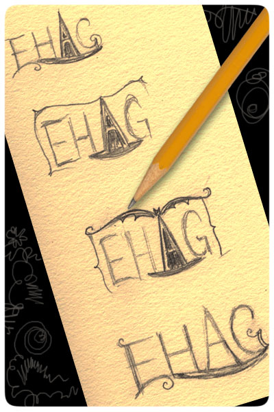
* Here are extremely rough sketches just to get my thoughts on paper... I had a vision to blend the "A" of EHAG somehow with a witch's hat, and slowly it evolved...
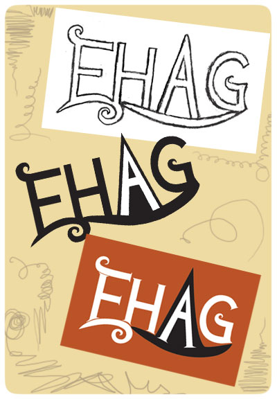
* Next, a rough, line-art pencil logo was scanned, and then I made it into a vector-based file in Adobe Illustrator, pulling and tweaking the letters until they started to take shape... First, the thought was to place the logo over an orange rectangle.... But, then orange turned into pumpkin...
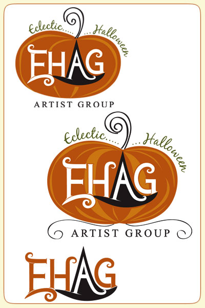
* As the pumpkin base took shape, I thought of applying script-style text in green as vines, but that did not translate so well when reduced in size. In the meantime, JP suggested adding a curl to the "H"....
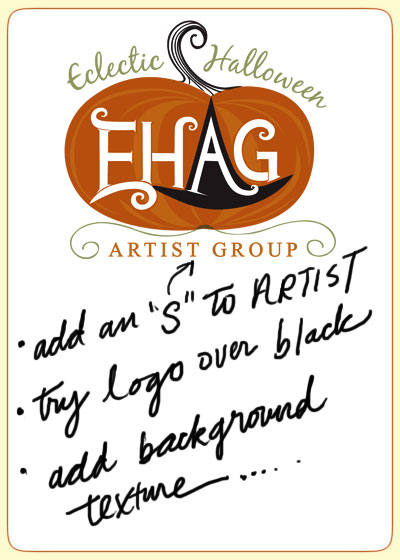
* Finally, I shared this image with our EHAG mod's group, and they loved it! Phewwwwww...... It was a lot of work getting here. Just a few additions and a few more days, and I was ready to finish!
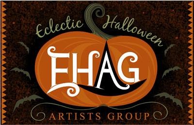
* And WaaaaaLaaaaaa, here she is! It's BOLD and it screams HALLOWEEN in a classy sorta way.... YAY!.... You can view it full size and see other various banners and badges I made at www.ehagart.blogspot.com.
Cheers to my fellow artist friends in EHAG! This is my gift to you :-)
~ Johanna
* Here are extremely rough sketches just to get my thoughts on paper... I had a vision to blend the "A" of EHAG somehow with a witch's hat, and slowly it evolved...
* Next, a rough, line-art pencil logo was scanned, and then I made it into a vector-based file in Adobe Illustrator, pulling and tweaking the letters until they started to take shape... First, the thought was to place the logo over an orange rectangle.... But, then orange turned into pumpkin...
* As the pumpkin base took shape, I thought of applying script-style text in green as vines, but that did not translate so well when reduced in size. In the meantime, JP suggested adding a curl to the "H"....
* Finally, I shared this image with our EHAG mod's group, and they loved it! Phewwwwww...... It was a lot of work getting here. Just a few additions and a few more days, and I was ready to finish!
* And WaaaaaLaaaaaa, here she is! It's BOLD and it screams HALLOWEEN in a classy sorta way.... YAY!.... You can view it full size and see other various banners and badges I made at www.ehagart.blogspot.com.
Cheers to my fellow artist friends in EHAG! This is my gift to you :-)
*EHAG Logo Design: © 2009 Johanna Parker Design